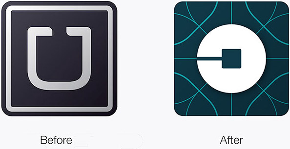
Mobile transportation pioneer Uber recently unveiled a new brand. Gone is the iconic ‘U’ logo replaced by new rider and partner icons coupled with a new logotype.
Let’s begin with some background before we jump in on Uber’s brand.
The term “branding” originated in ancient Egypt through the act of marking livestock with fire-heated marks to identify ownership. A hot iron was used for branding, pressing a heated metal shape against an object with the intention of leaving a mark.
In marketing, a brand is traditionally defined as:
The marketing practice of creating a name, symbol, or design that identifies and differentiates a product from other products.
Using brand and logo interchangeably is like thinking that the visible part of the iceberg is the entire iceberg. We all know how well that worked out for the Titanic.
In reality, the definition goes much deeper:
A brand is what people say about you when you’re not around. It’s the sum of the visual and non-visual aspects that collectively give individuals a reason to believe in an organization, buy its products, and dedicate their careers to fulfilling its mission.
 Whether you love or hate the new look, the logo is only part of Uber’s story.
Conceived on a snowy Paris evening in 2008, Uber founders Travis Kalanick and Garrett Camp were having trouble getting a cab. So they came up with a simple idea – tap a button, get a ride. They developed an app which began as a way to request premium black cars in a few large cities. Today, Uber is available in 400 cities (we’re still waiting in my hometown) and in 65 countries.
Uber riders hail drivers using a mobile app. Drivers use their own vehicles to shuttle riders to their destination, often for less than traditional taxis.
Modern-day branders like Uber understand that a brand is much more than a logo. Talk about a reason to believe and dedication – drivers use their personal vehicles to give tourists and inebriated college students rides.
 The truly unique aspect of Uber’s new brand is each of the 65 launch countries has the freedom to tailor the colors and brand elements – patterns, illustrations, photography, etc. to their locality. That kind of autonomy is unprecedented in a company with a multi-billion dollar valuation – $68 billion to be precise, more than Ford, General Motors, and Honda.
When talking about Uber’s new brand, Kalanick said, “Uber started out as everyone’s private driver. Today we aspire to make transportation as reliable as running water, everywhere and for everyone. Our new brand reflects that reality by working to celebrate the cities that Uber serves.”
That, my friends, is the entire iceberg.
By Jason Piasecki, Partner + Wannabe Uber Rider


