Over the next few weeks, we’re going to be digging into the 5 most important reasons to upgrade your website – and just what and why you should be upgrading.
Reason 1: Responsive Design.
We get it; not every website is going to serve the same purpose, not every budget or target market is the same – but that’s no excuse to force visitors to use a clunky, uninspired site that doesn’t provide the information they need or the experience they want … and doesn’t work on their phones either.
Let’s dive in!
Part 1: Responsive Design
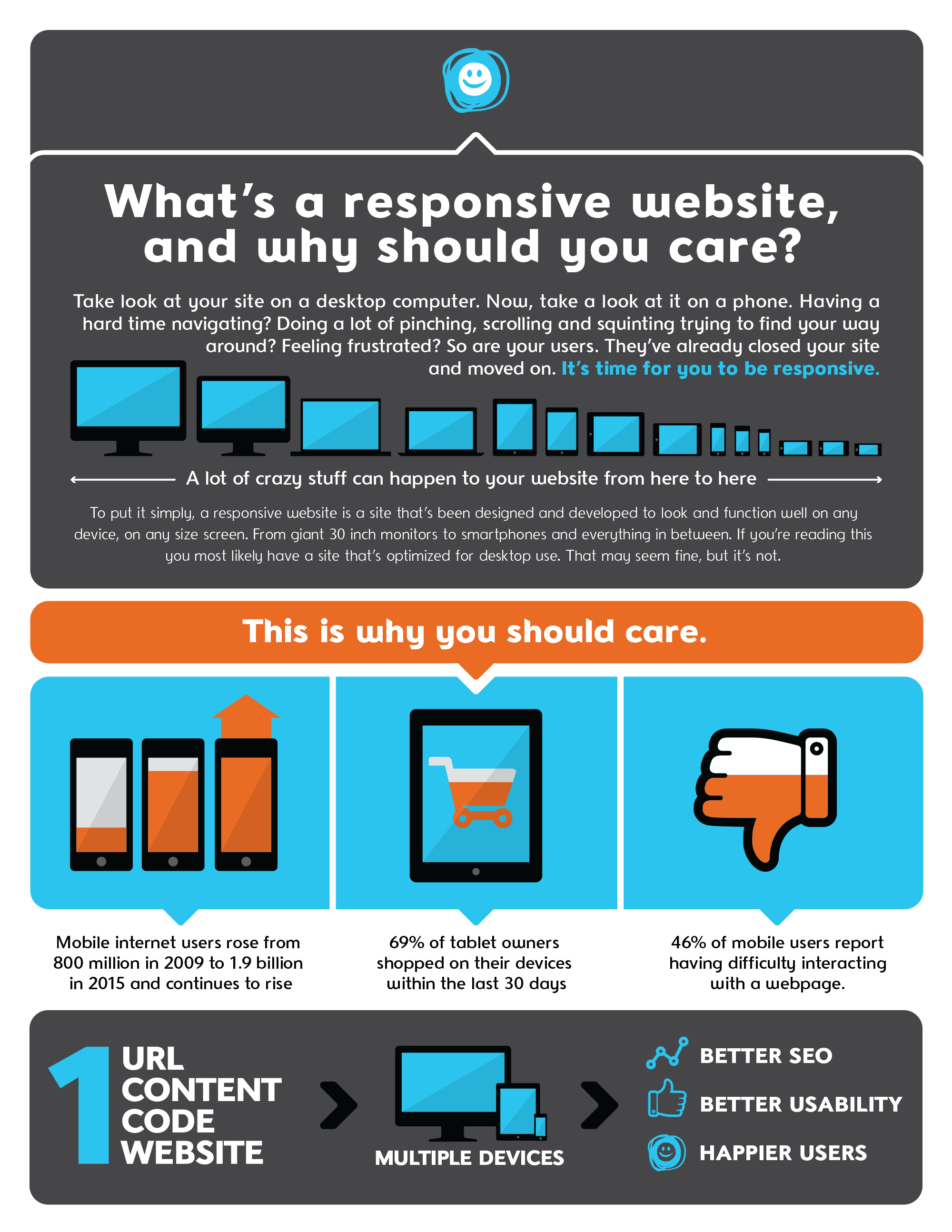
Responsive design is, in a nutshell, a site designed to respond and scale to whatever device is being used to view it: different desktop monitors, smartphones, tablets, you name it. The infographic below illustrates a sampling of the different screen resolutions out there. As you might think, this makes a world of difference in accessibility and consistency across platforms. Site visitors will not only get the full experience, even if they are browsing with a small-screened smartphone, but they’ll also be right at home when they get a chance to visit the site from a computer/fully-functional browser.

The alternative to responsive design – if you want to appeal to the masses, that is – is creating an entirely separate “mobile version” of the site. That means more time, more to keep track of, more to update, and just more headaches all around. With responsive design, it’s all the same site. Same URL, same content, same awesome experience.
The bonus? Google smiles on responsive design too. The online giant, who boasts 67% of the search engine market share, calls responsive design the industry best practice and tends to favor these types of websites because they are easier to crawl and index.
It’s pretty straightforward: responsive design might take a little more legwork up front, but, in the long run, it’s easier for you to manage and creates a far better experience for the people visiting your site.
Next time, we’ll look at another major way to step up your web game: switching to WordPress.


